THE CLASSIC + WHITE REINVENTED
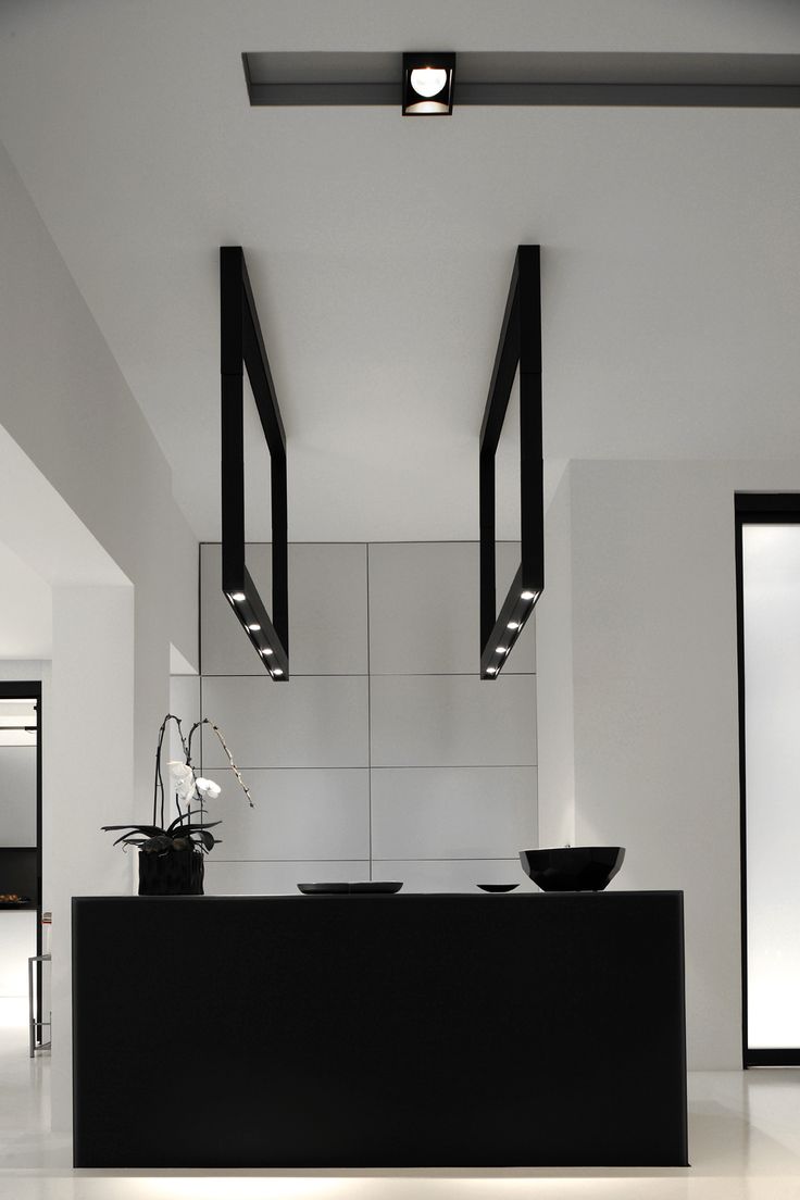
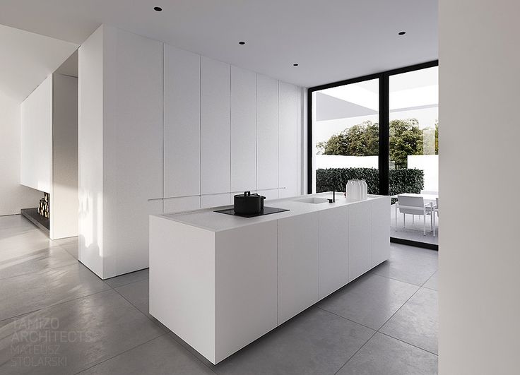
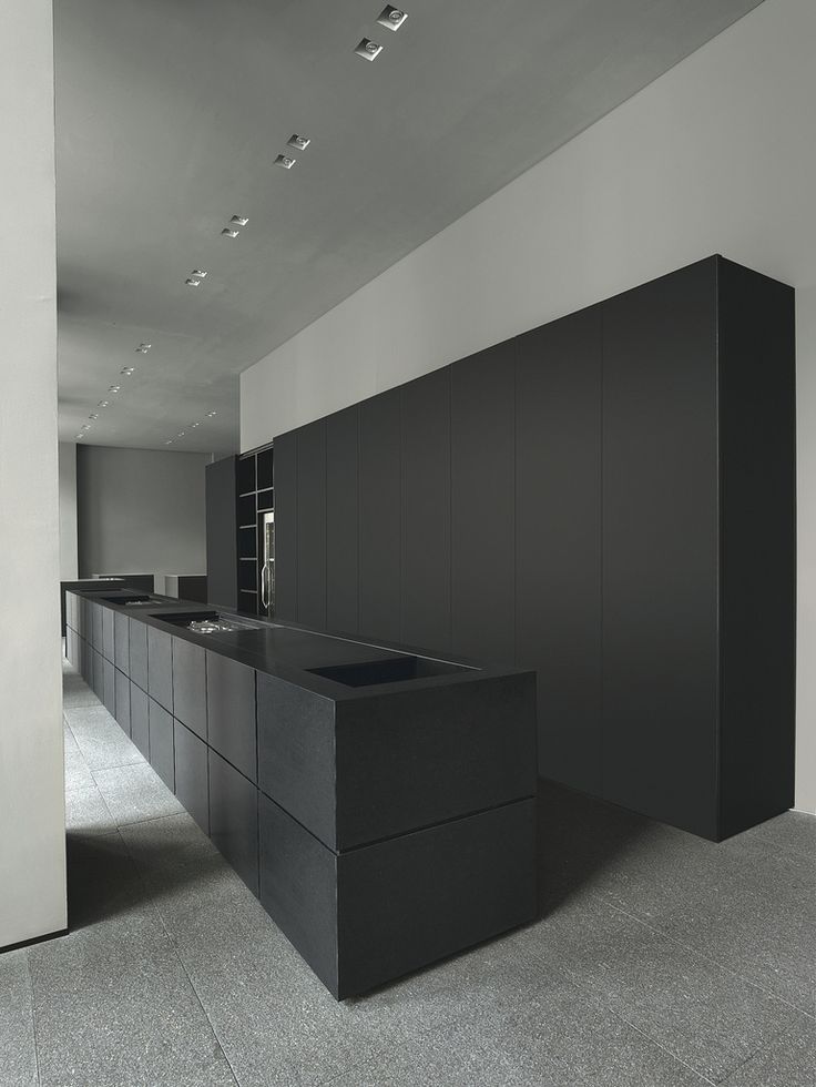
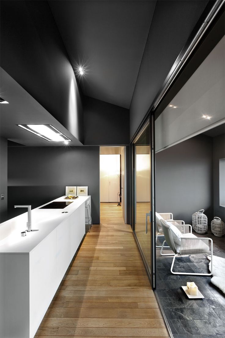
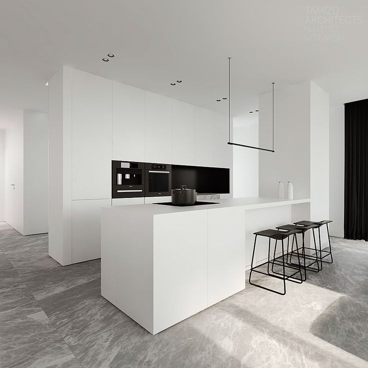
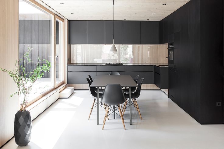
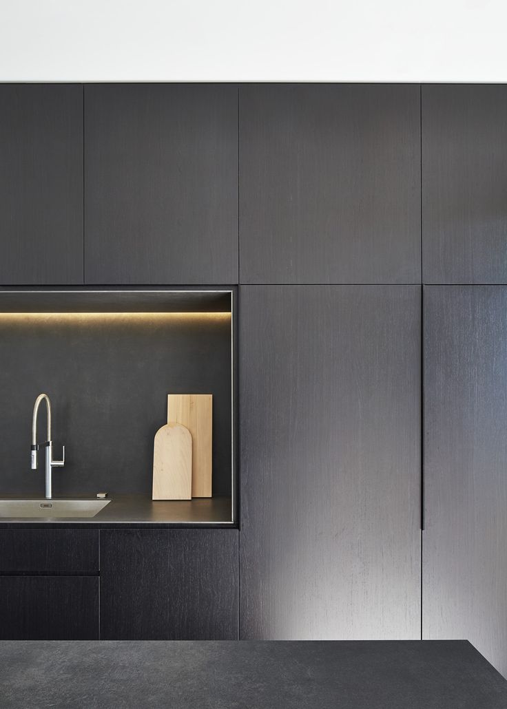
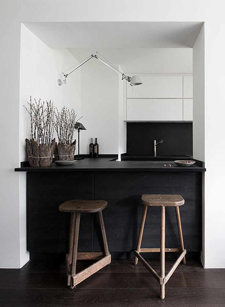
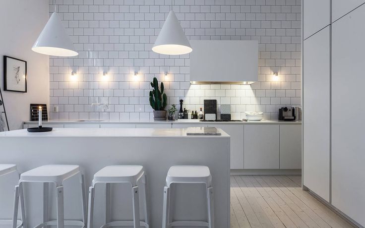
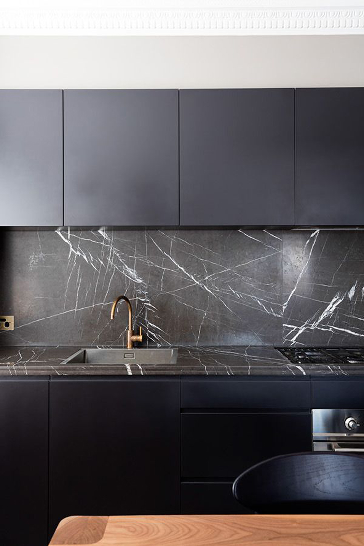
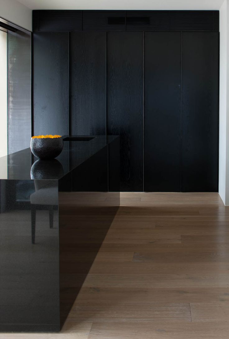
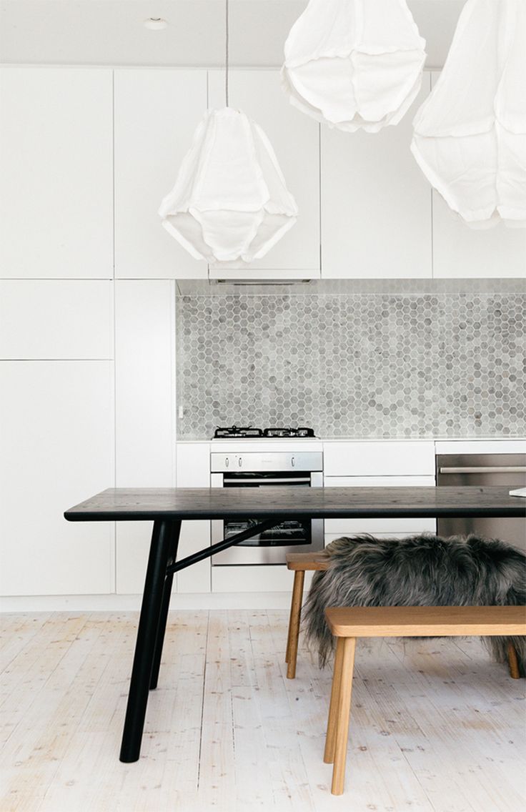
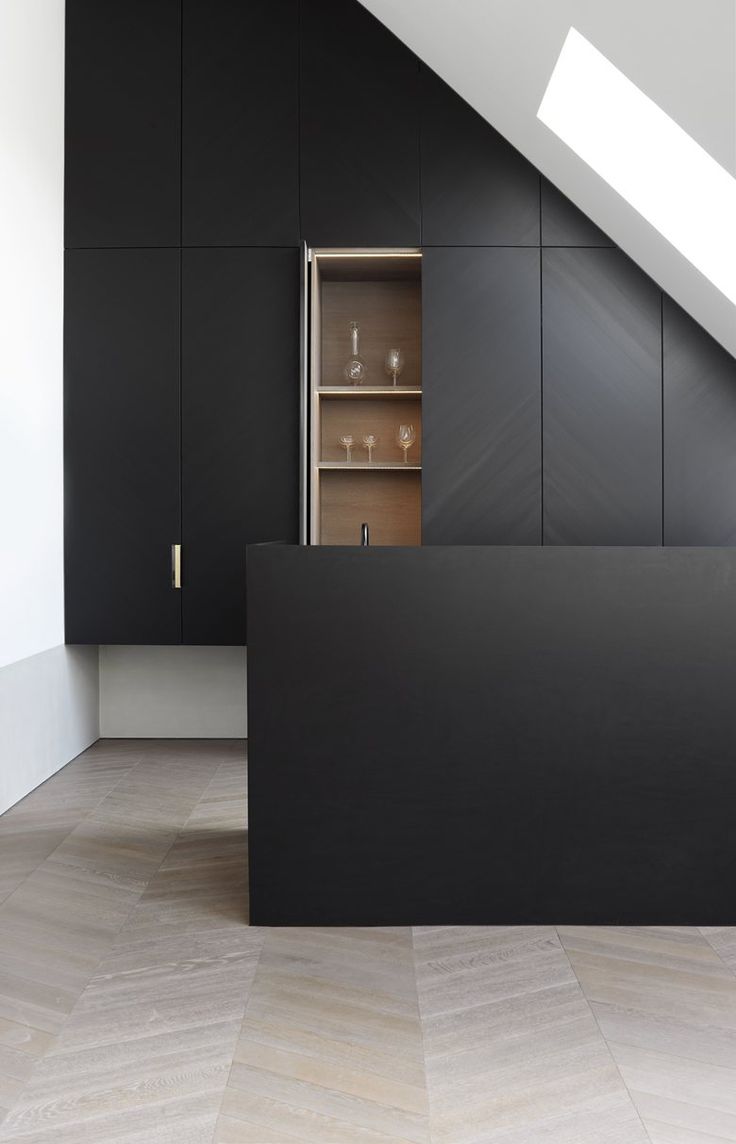
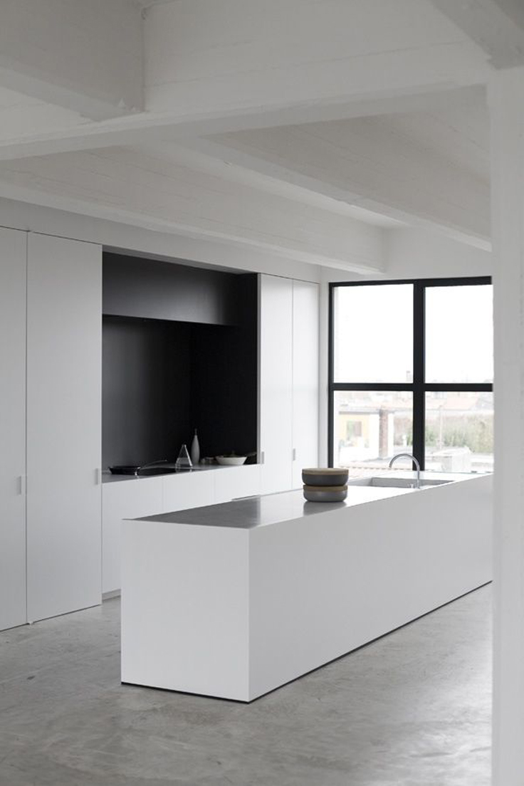
The black + white ensemble has been consistent with its popularity throughout the years and it seems like it’s not going away any time soon. The classic duo has been conquering the kitchens of the world slowly, but surely. What I have noticed as well is the simplicity and boldness in size and format of the cabinets – the bigger the better. Hardware is scarcely present and transforms these cabinets visually into built-in closets and makes the transition from the rest of the home more seamless and clean. The only features that give it away as a kitchen are the faucets and stoves and such.
No Rules Applied
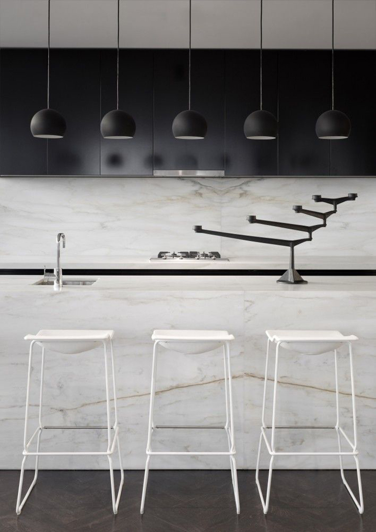
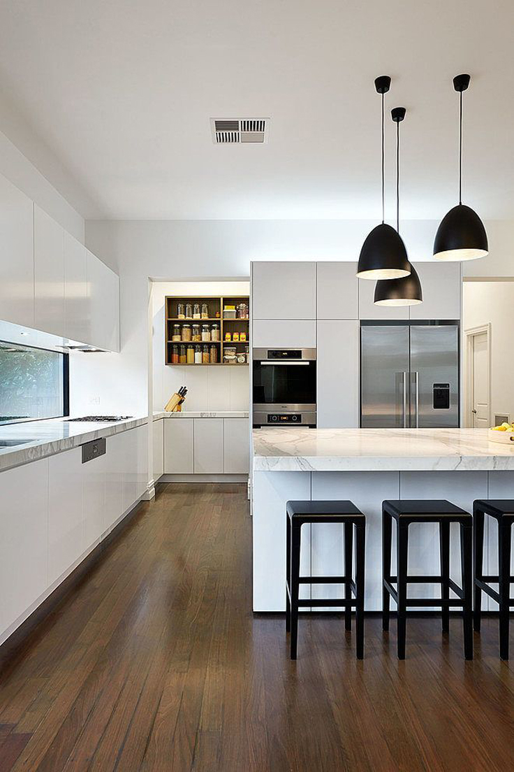
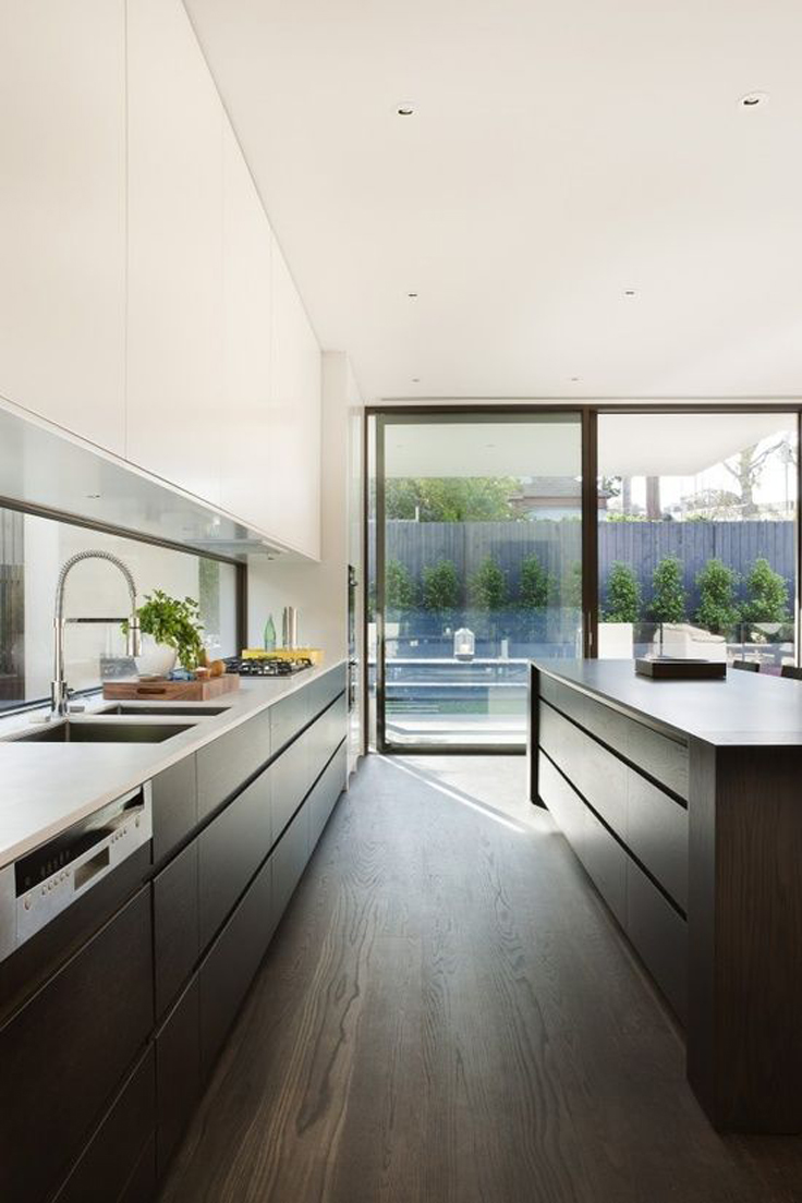
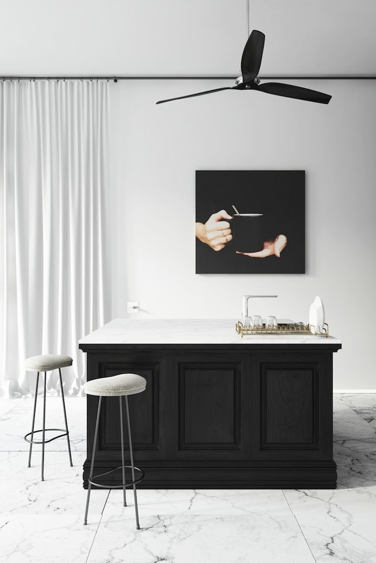
The rule of using the same color finish for all cabinets was busted and thrown overboard a long time ago. Increasingly, more designers seem to enjoy that and are not afraid of mix and matching both colors. If they don’t mix and match, they usually go for the extreme: all white or all black everything. Sometimes you will even find wood tones as accents to add a bit more warmth to this “menage a troix”. There was a time where the piano high gloss finish was the thing to do – well, now it’s quite the opposite. Matte is the way to go and definitely conveys a more contemporary or futuristic feel. To add visual interest they either add marble countertops or an oversized piece of artwork to create a feature wall that complements the color scheme of the cuisine.
The Kitchen Is The Center Of The Home
I couldn’t agree more with this statement! It seems like the kitchen island has made it’s comeback to the designer’s heart. It was never actually gone, but it has won a bigger spot in their hearts. Now you see enormous kitchen islands that give more counter space, especially for those gourmet chefs that need it, and seating space for more people. So again – the bigger, the better. Some designers even reduce their kitchen design just to a gigantic kitchen island and incorporate all features needed for cheffing up the perfect meal.
Would you design your kitchen and make the black + white your theme?
Let me know, what you think!
XO – Márcia
SOURCES
Image 1 :: Unknown
Image 2 :: Seen on CadreProloge 145 in-Dolma PID single
Image 3 :: Seen On Tamizo Architects
Image 4 :: Design by Elenberg Fraser, Seen on Archdaily.com
Image 5 :: Designed by Minotti
Image 6 :: Seen on Undicilandia.it
Image 7 :: Designed by LSA Architects, Seen on Designyoutrust.com
Image 8 :: Unknown
Image 9 :: Designed by Tamizo Architects, Seen on Tamizo.com
Image 10 :: Designed by Format Elf Architekten, Seen on Dwell.com
Image 11 :: Designers at Vipp Shelter, Seen on Stylejuicer.com
Image 12 :: Designed by DKO, Seen on DKO.com.au
Image 13 :: Image by Isabella Magnani, Seen on Myparadissi.com
Image 14 :: Styled by Lotta Agaton, Seen on Designmilk.com
Image 15 :: Design by TFAD Architects, Seen on Plastolux.com
Image 16 :: Rendering by Katty Schiebeck, Seen on Cocolapinedesign.com
Image 17 :: Unknown
Image 18 :: Images by eclecticool.es, Seen on Decoracion.facilisimo.com
Image 19 :: Designed by Bernd Gruber Architekten, Seen on Archilovers.com
Image 20 :: Designed by Tamizo Architects, Seen on Tamizo.com

