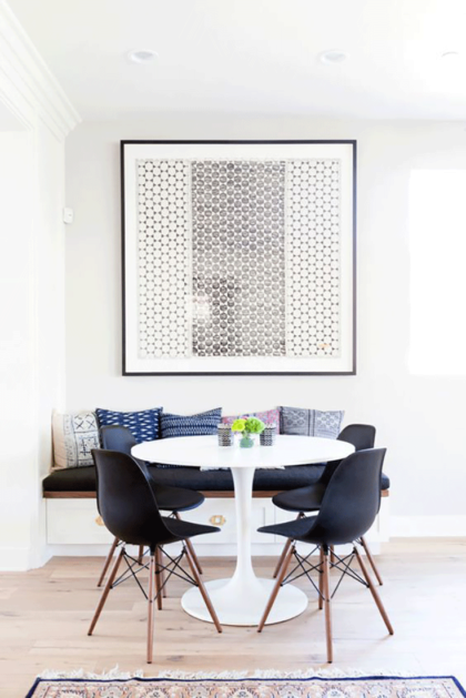
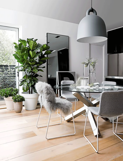
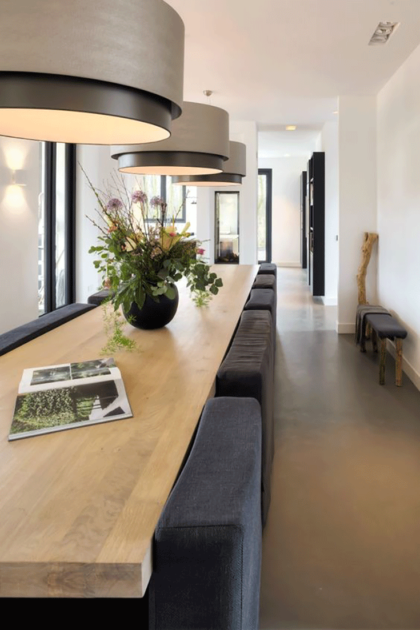
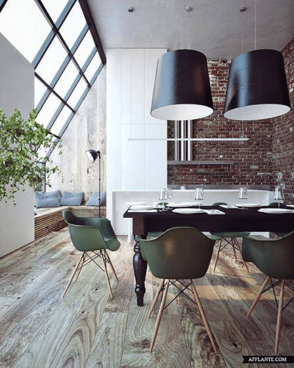
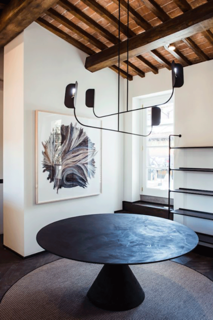
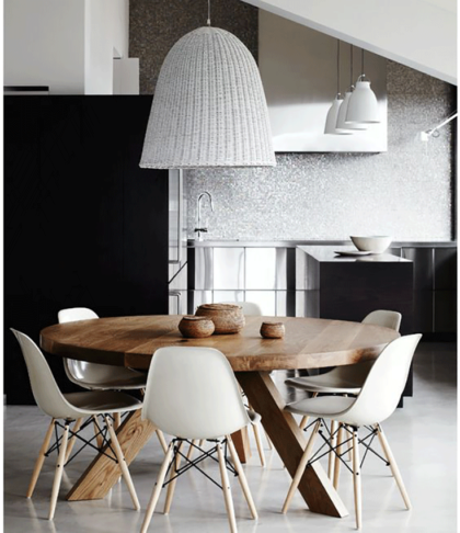
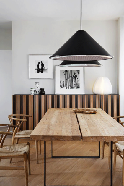
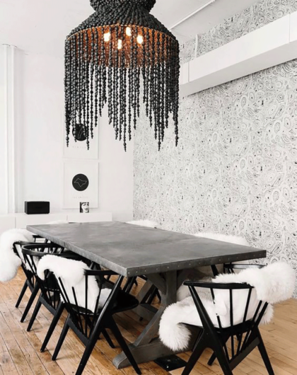
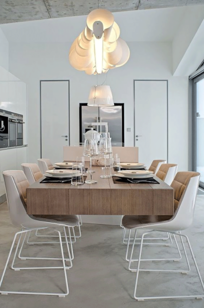
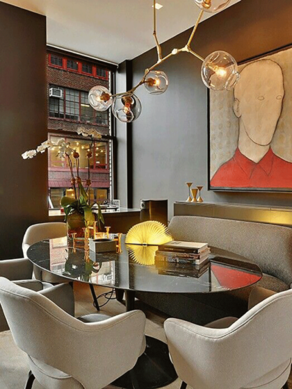
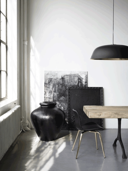
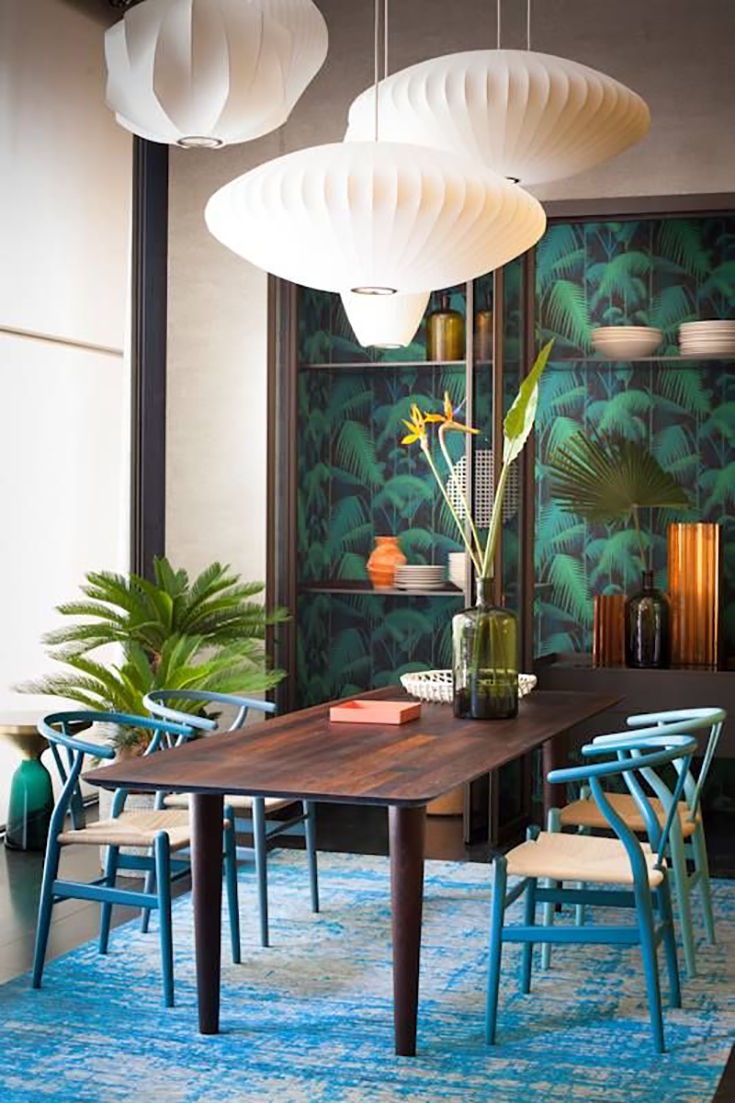
The dining room is a pretty multi-functional room in our home. This is where we eat, work or craft up some DIY projects. It’s basically where a lot of the action and magic happens. It is also a space where great conversations & discussions are held and, of course, memories are made. I think it’s essential to maximize the way you live and use your domicile. It’s healthy and makes you feel happy and more at home, as it offers to house and manifests all layers of your personality.
A QUICK GUIDE TO CREATING DECOR VIGNETTES
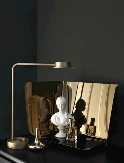
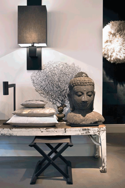
There is something about odd numbers, that does the magic in the cluster universe. The power of a cluster lies specifically in the group of objects working collectively and not individually. It’s almost like each of their individual aesthetic strength merges into one and sends a message to the observing eye: ” Yes, we look all so different, but yet we belong together!”
What I love most about clustering pieces is that (at least in my world) there are no rules. I go about it almost intuitively. While going through trial and error, I do realize the more opposite the materials are, the better they look as a unit! Further, the more unique they are, the more they complement each other. I personally enjoy mixing eclectic and sometimes ethnic pieces into a modern context, which is the style I mostly feel comfortable in.
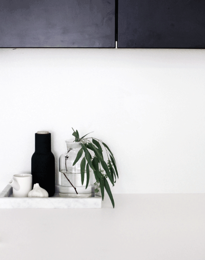
Another key aspect of creating a decor vignette is to also mix items with different heights AND opposing shapes. It visually creates a 3-dimensional dynamic, which accentuates their visual composition. Putting 2 accessories with different shapes, but similar heights together don’t mix well as they are actually competing with each other since they share one characteristic: Which is the same height!
Here are different ways and essentials for arranging/composing a cluster. If you want to see some live action, check out this video where I style my shelves using these techniques.
TRIANGULAR ARRANGEMENT
The triangular cluster is defined by using at least 3 accessories with distinct heights and textures, offsetting each other creating a so-called “triangle”.
Tip: It takes some shifting and testing of the different looks. Take a step back and see which look you prefer.
5 ACCESSORIES THAT ARE TRENDING IN 2017
Accessories are really, what makes the room come to completion. It’s the cherry on the icing ( perhaps the icing on my all time favorite carrot cake! Recipe soon to be shared ;-)).
The more, the merrier. I personally love collecting them piece by piece, rather than going to Home Goods and just filling up carts, due to lack of patience for the process. In this case I think it’s totally worth waiting for the right piece vs. just buying things that are good enough or available now. Pinterest is packed with ideas, and I have noticed some statement pieces that could definitely serve as conversation starters that definitely would have an impact in any space.
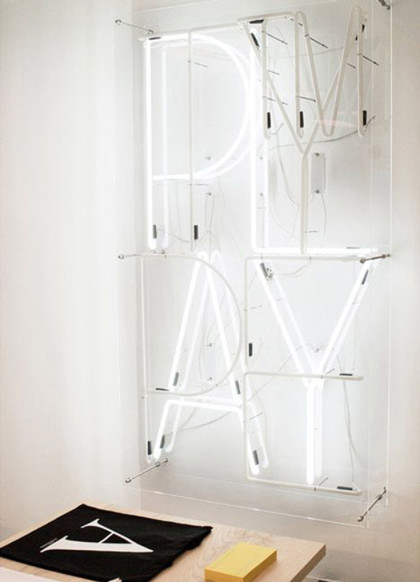
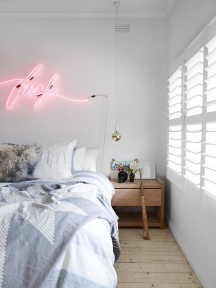
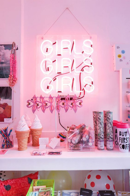
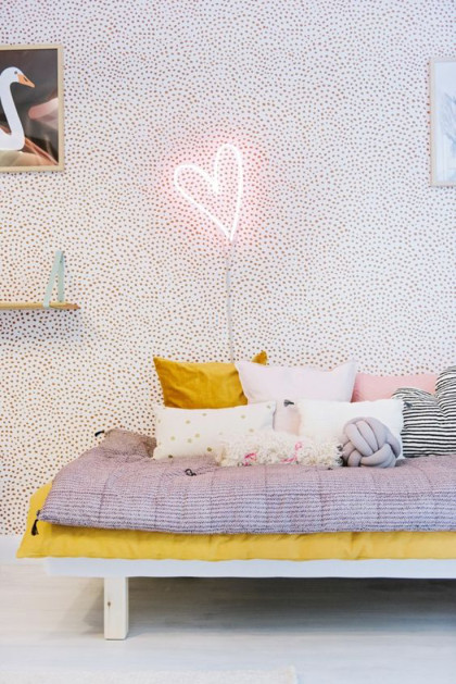
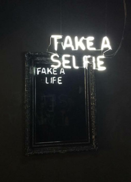
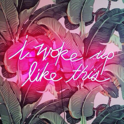
Neon Light Signage
I love playing with the unexpected. This probably transcends from my personality: in between my ever so resting bitch face, you’ll find me rolling on the floor, because of a spontaneous laugh flash (yup that’s me! I get to 100 real quick!).
Unsurprisingly, I find my eyes drawn to neon light signage lately. Yes, it is a light, but this function becomes almost secondary. The light and the font collectively could be layered as an additional and unusual texture. Further, it’s a great way of bringing in some color since these lights can be made in different nuances. Besides that, it’s a fun opportunity to include typo into a decor scheme for all the font and quote lovers.
Let’s be honest, it’s really not that easy to source motifs for a gallery wall. Clients frequently ask me how to mix different medias and I often find myself sharing the same approach: The more diverse the collection the more dynamic and enriched the gallery wall becomes. The trick is to arrange and re-arrange the art pieces until it visually complements and makes sense. With that said: Lay them out and make sure neighboring pieces have at least one thing in common: Whether it is the color or pattern that these have in common, it really doesn’t matter.
10 WAYS TO STYLE UP YOUR APARTMENT
The struggle of styling your apartment is real. We all know it. We all go through it. How much do I want to spend on decor? How long am I going to stay for? Should I buy this furniture piece, risking it may not fit in my next place? This is literally the monolog I have on a regular basis.
In my case I sort of go with the flow and I think it’s important to feel good and at home (rented or owned). So I don’t like to restrict myself and like to navigate within the possible and the temporary.
To start things, figure out a master plan and dedicate a budget towards this project, whether you just invest a big chunk of money right away or if you want to dedicate a certain amount per month and splurge on accessories and furniture as you go. The important thing to keep in mind is to make sure to invest in temporary and versatile pieces that won’t ruin any surface in your apartment. Simply, things you can take with you when you move out.
I have created a list of ways on how to effectively style your apartment.
Let’s jump right into it!
Temporary Wallpaper
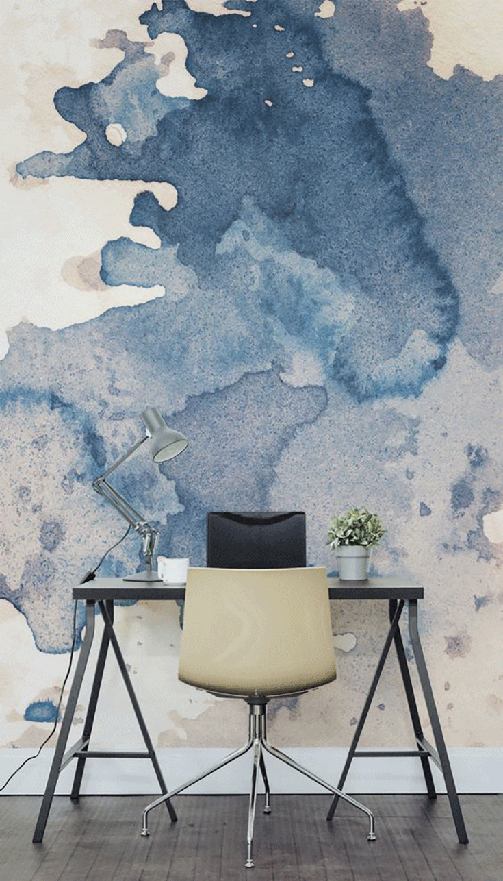
Wallpapers are a great way to add character to your home. They are complicated to install, especially, if you are working with patterns or large murals, that needs to be aligned to be perceived as one collective image. The glue is meant to last, which means, taking it off would be quite a project. Thank god for temporary wallpapers! These are just as fancy and a breeze to remove. They definitely are statement pieces that have a great impact in your interior. Essentially it’s like having large unframed artwork.
Tip: Self adhesive vinyl wallpaper is perfect for apartment use. You can actually reuse them by putting it back onto the adhesive backing it came with (it’s hard but doable! It just takes patience, time and at least 2 people!) and reapply it to the walls in your next place.

