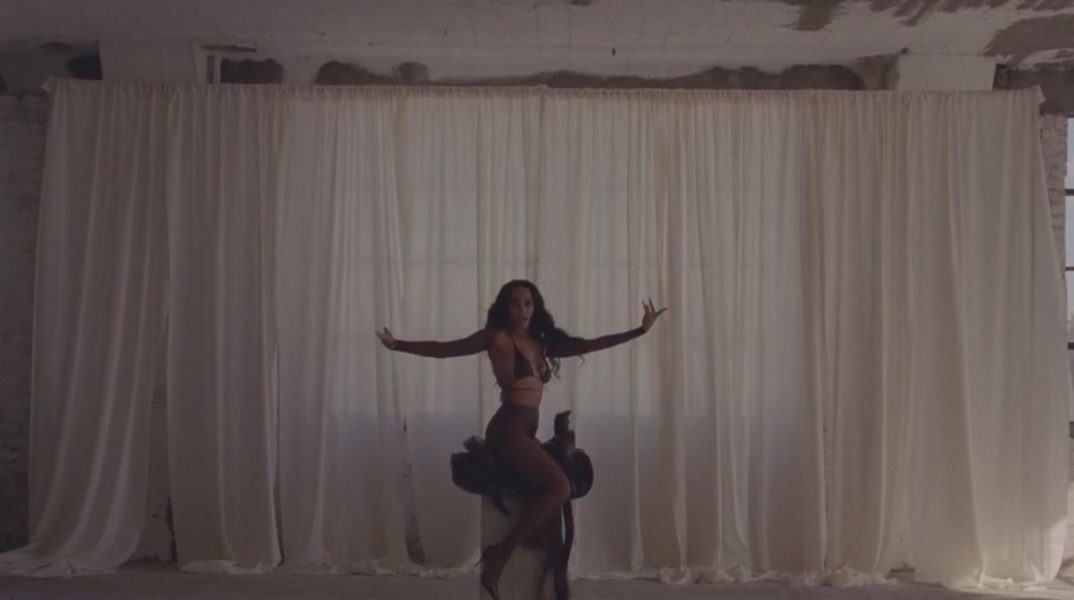
WHEN I GET HOME :: SOLANGE
I’M in the midst of planning a video shoot and have been working hard to create a cohesive visual story. Because I am venturing in the audiovisual field, I definitely appreciate this video.
Continue Reading
I’M in the midst of planning a video shoot and have been working hard to create a cohesive visual story. Because I am venturing in the audiovisual field, I definitely appreciate this video.
Continue Reading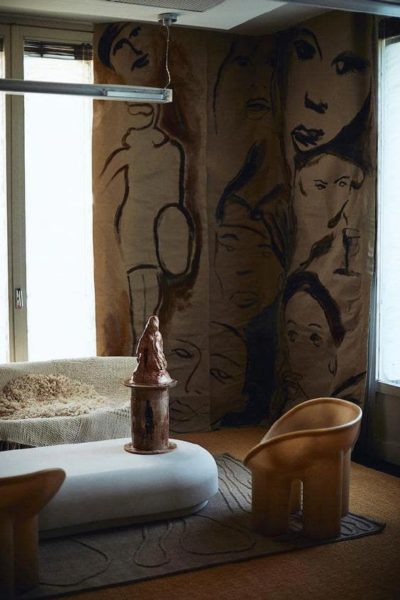
HOW ROUND FURNITURE PIECES ARE GOING MAINSTREAM This trend has been present for A WHILE. I remember skimming through magazines and seeing these editorial vignettes featuring hyper curvy furniture.
Continue Reading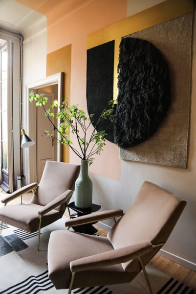
Little Update on Life and My Current Color Combo All In One! My sincerest apologies! I’ve been away for a whole year!
Continue Reading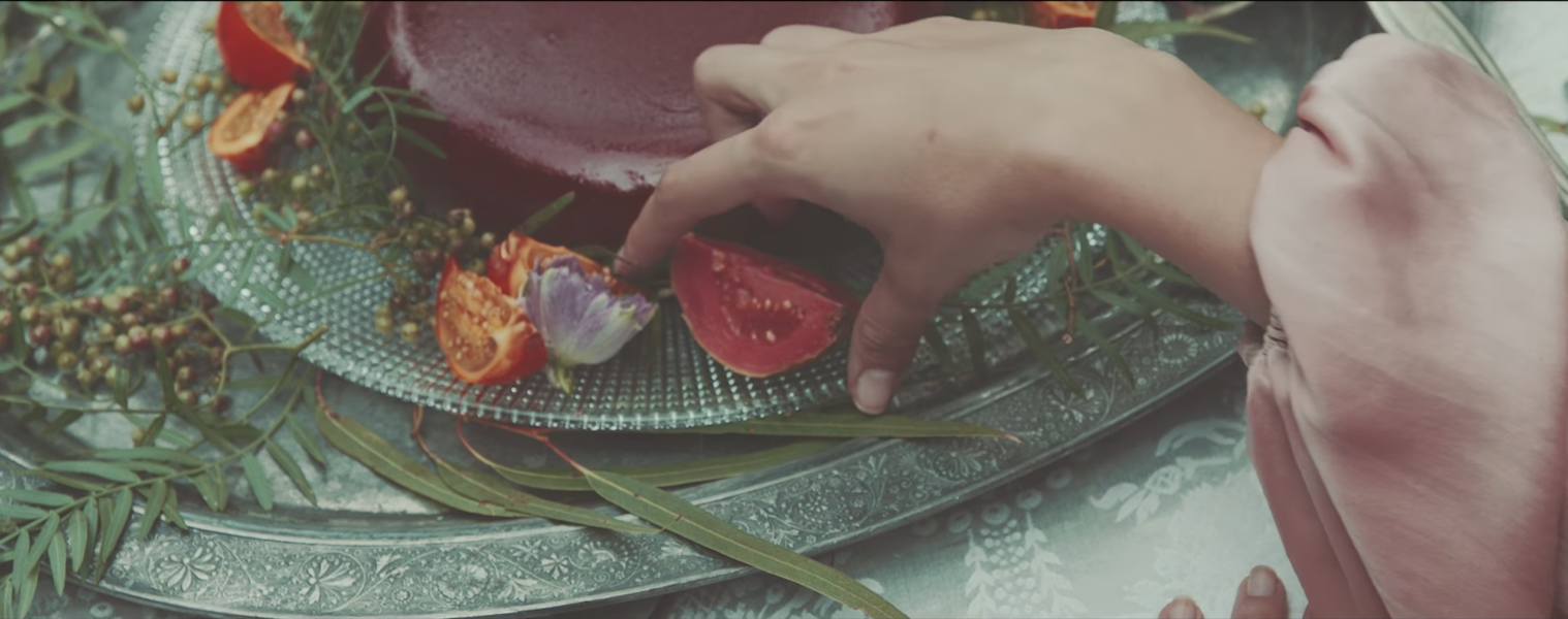
After a moody couple of days, reduced sunlight and daylight savings kicking my ass, this song really hits a sweet spot!
Continue Reading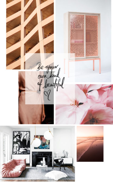
The long lasting Summer merging into a colorful autumn changed my feelings towards this season completely. To me, this experience re-defined the equivalence of fall and ultimately made me fall utterly in love with it! In honor of this beautiful and natural phenomenon, I created a mood board playing with the different blush nuances, which I see reflected in the foliage and that I'm aiming to incorporate in my color schemes and outfits.
Continue Reading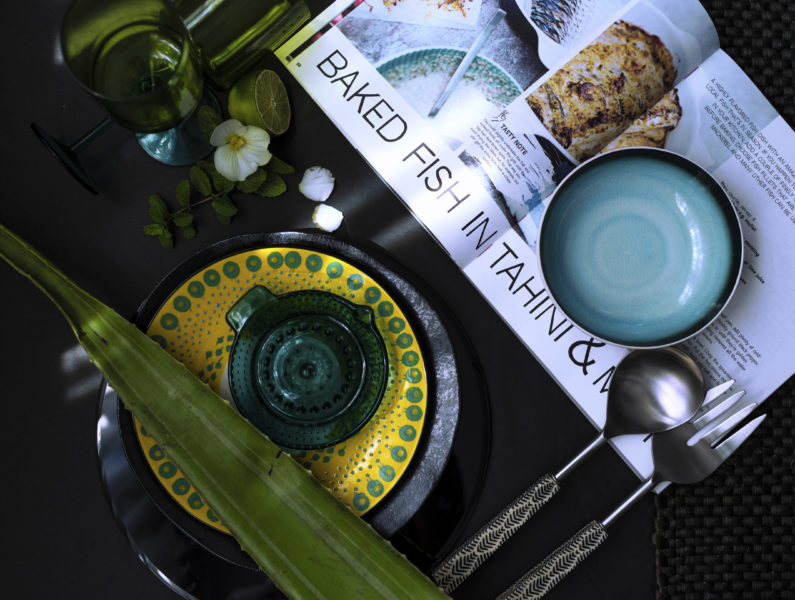
It’s been quite a challenging month between working on design projects, entertaining my 6-year-old and keeping up with life. There had been plenty of moments where I had considered having a drink for breakfast, which is actually a real thing in Germany (I swear!
Continue Reading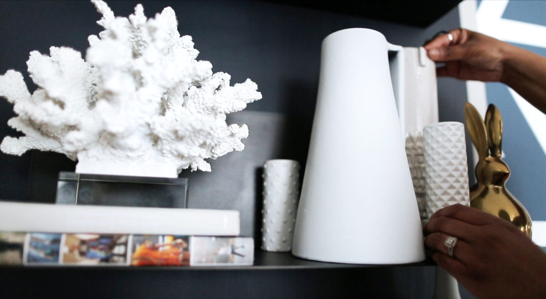
There Are Infinite Possibilities to Style Shelves & Here is How I Styled Mine
Continue Reading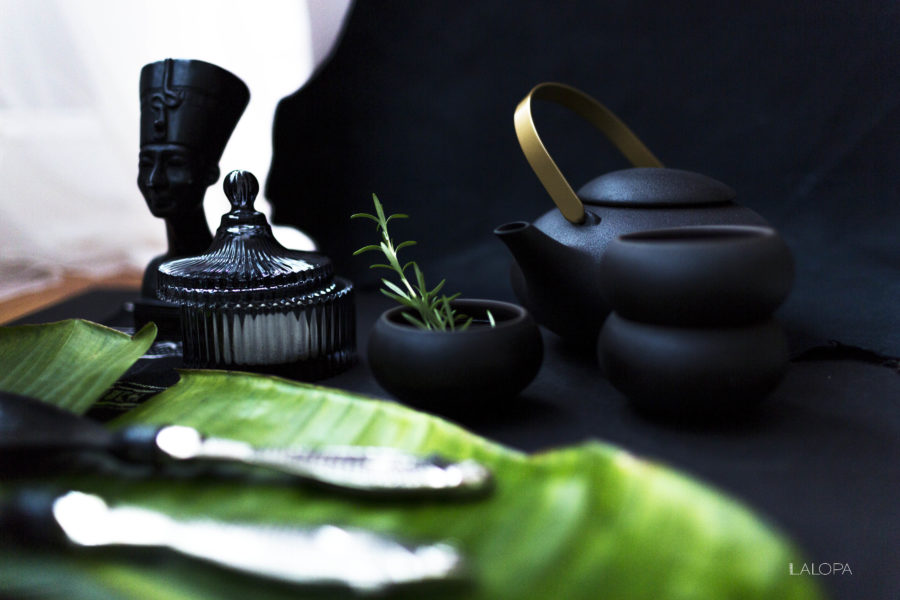
For someone, who has an infatuation with tableware, I haven’t posted much about it. I actually enjoy shooting those as it is a fun and creative way to experiment with textures on a smaller scale.
Continue Reading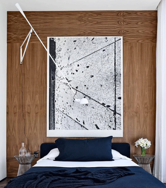
Sconces Are Uhh-mazing And Here Is Why First of all, I would like to share, I was never a big fan of sconces.
Continue Reading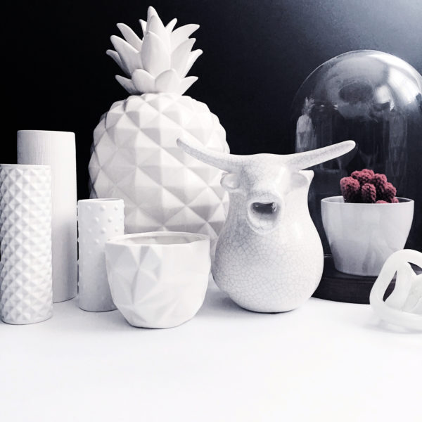
Why Only White Vases And Decor? A while ago I saw a merch display that featured all white vases and nick-nacks.
Continue Reading
Let’s be honest, it’s really not that easy to source motifs for a gallery wall. Clients frequently ask me how to mix different medias and I often find myself sharing the same approach: The more diverse the collection the more dynamic and enriched the gallery wall becomes. The trick is to arrange and re-arrange the art pieces until it visually complements and makes sense. With that said: Lay them out and make sure neighboring pieces have at least one thing in common: Whether it is the color or pattern that these have in common, it really doesn’t matter.
Instead of resting and getting settled after our Germany trip, I tackled our deck that needed some rearranging. Definitely, need some more accessories and tons of plants!
For more little snippets out of my life and DIY moments at my domicile add me on SnapChat: @maisonlalopa.
Lately, I have been obsessed with gold/ brass furniture and have been daydreaming of owning an Armoire or sideboard in that very same finish. Luckily I stumbled upon this gem of a store:”Blush” is a boutique florist in Auckland’s Parnell, New Zealand. It’s interior was designed by owner and creative director, Kelly Karam. She teamed up with Powersurge (brass ladder) and Thinkpack (packaging) to create a complementing and continuous brand identity. It’s evident that Kelly has an immaculate eye for design has done a great job putting it together.
I binged the heck out of the Netflix Original Series “Abstract :: The Art of Design and absolutely love it!
The selection of artists and the and their unique perspectives and takes on Design. SO inspiring and rejuvenating! Who stood out to me the most is Es Devlin a renowned Stage Designer. You might have been exposed to her stunning artistry already, without even knowing! Famous institutions and music artists such as Beyoncé, Jay-Z, Kanye West, Lady Gaga, Sam Smith and more have collaborated with this hyper talent!
“Looove the moodiness and how each shot complements the other – almost like a mood board. Mystical yet beautiful. I wished I could navigate life like this girl navigates them waves!”
˜ Márcia

