A QUICK GUIDE TO CREATING DECOR VIGNETTES
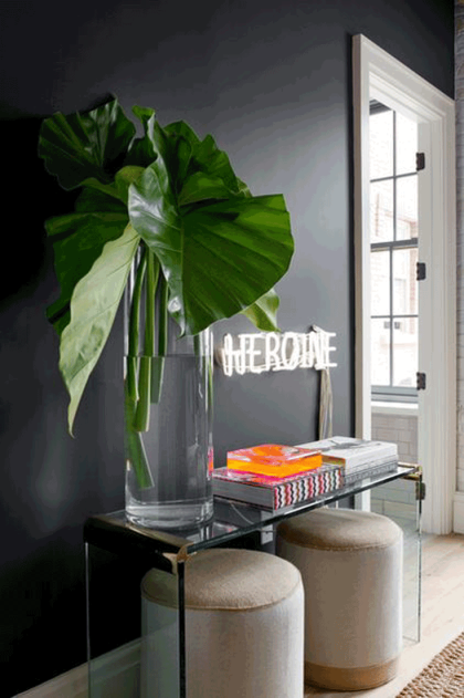
There is something about odd numbers, that does the magic in the cluster universe. The power of a cluster lies specifically in the group of objects working collectively and not individually. It’s almost like each of their individual aesthetic strength merges into one and sends a message to the observing eye: ” Yes, we look all so different, but yet we belong together!”
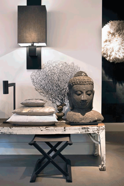
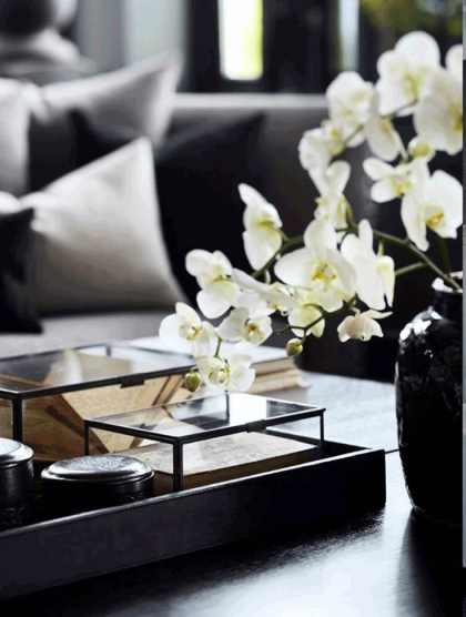
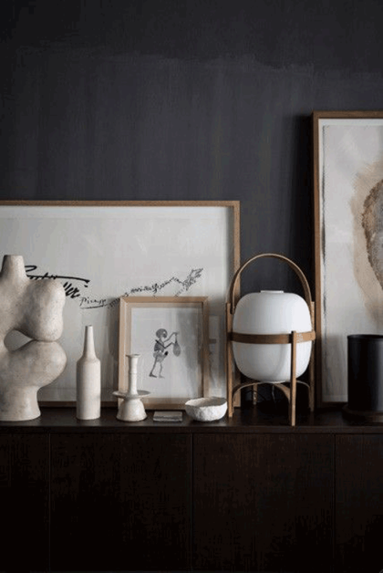
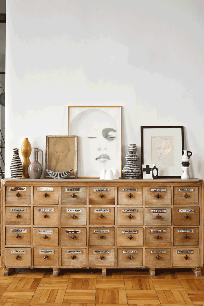
What I love most about clustering pieces is that (at least in my world) there are no rules. I go about it almost intuitively. While going through trial and error, I do realize the more opposite the materials are, the better they look as a unit! Further, the more unique they are, the more they complement each other. I personally enjoy mixing eclectic and sometimes ethnic pieces into a modern context, which is the style I mostly feel comfortable in.
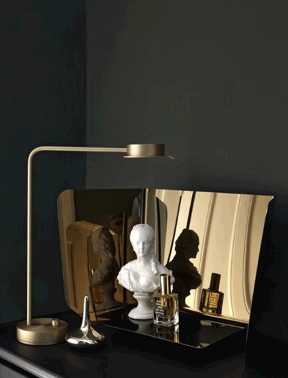
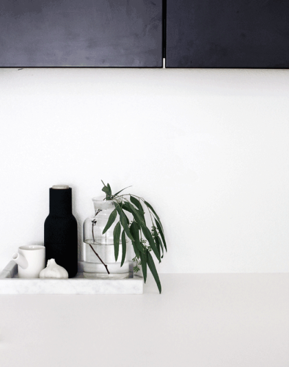
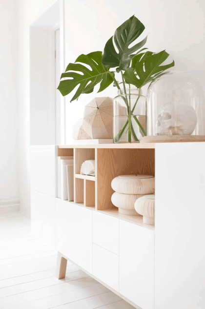
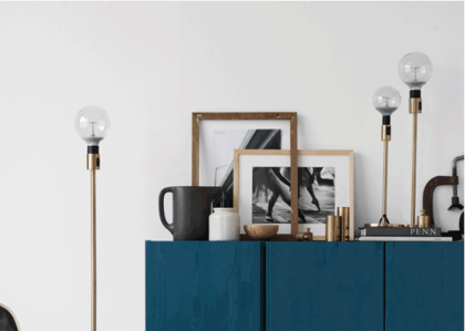
Another key aspect of creating a decor vignette is to also mix items with different heights AND opposing shapes. It visually creates a 3-dimensional dynamic, which accentuates their visual composition. Putting 2 accessories with different shapes, but similar heights together don’t mix well as they are actually competing with each other since they share one characteristic: Which is the same height!
Here are different ways and essentials for arranging/composing a cluster. If you want to see some live action, check out this video where I style my shelves using these techniques.
TRIANGULAR ARRANGEMENT
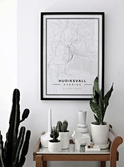
The triangular cluster is defined by using at least 3 accessories with distinct heights and textures, offsetting each other creating a so-called “triangle”.
Tip: It takes some shifting and testing of the different looks. Take a step back and see which look you prefer.
SYMMETRIC ARRANGEMENT
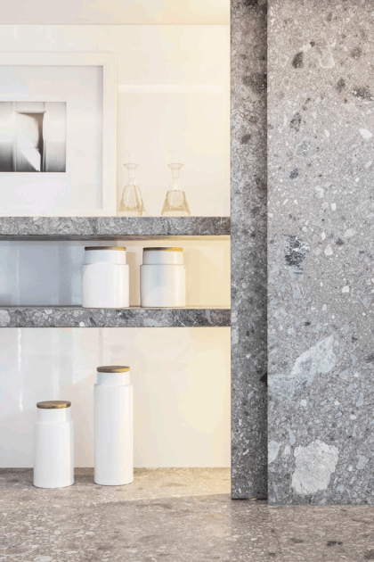
A symmetric cluster is defined by decor pieces being placed parallel to each other, thus drawing a symmetry between the items.
Tip :: This look demands a stringently organized look, as too many and different “symmetries” can exude a rather unbalanced feel.
ASYMMETRIC ARRANGEMENT
The asymmetric cluster is basically randomly placed accessories on an area, creating a composition defined by a rhythm, which is influenced by the different shapes and textures of the accessories.
Tip :: This approach definitely takes a lot more of trial and error. Every time you shift the decor around, the composition will look different each time and thus exude a different feel. Again, like in the triangular approach, take a step back and see which feel you prefer the most.
I hope this is helpful! Feel free to share your vignette below or let me know if you have any questions.
I will aslo post a “How- to” video discussing this topic in depth! Stay Tuned!
˜ Márcia
SOURCES
Image 1 :: Seen on Cocolapinedesign.com
Image 2 :: Via Pinterest, Unknown Source, Please notify me for adequate credit
Image 3 :: Seen on Rtlwoonmagazine.nl
Image 4 :: Via Pinterest, Unknown Source, Please notify me for adequate credit
Image 5 :: Via Pinterest, Unknown Source, Please notify me for adequate credit
Image 6 :: Seen on Iwantbigcloset.tumblr.com
Image 7 :: Seen on Rafa-Kids.blogspot.com
Image 8 :: Seen on Houzz.com
Image 9 :: Via Pinterest, Unknown Source, Please notify me for adequate credit
Image 10 :: Seen on Mechantdesign.blogspot.fr
Image 11 ::Via Pinterest, Unknown Source, Please notify me for adequate credit
Image 12 ::Via Pinterest, Unknown Source, Please notify me for adequate credit


I love this advice and this kind of decor. You made it sound easy. Going to try some of these tips with my decor to follow.
Thank you! It takes shifting and listening to your gut more! And it’s ok to go back and forth and see which version of the different looks you personally prefer. I sometimes even take photos to see which looks more photogenic (it’s super objective). You will be surprised it helps determine which look to go with, especially if you are stuck between 2 versions of the composition. Let me know how I can help! 😉