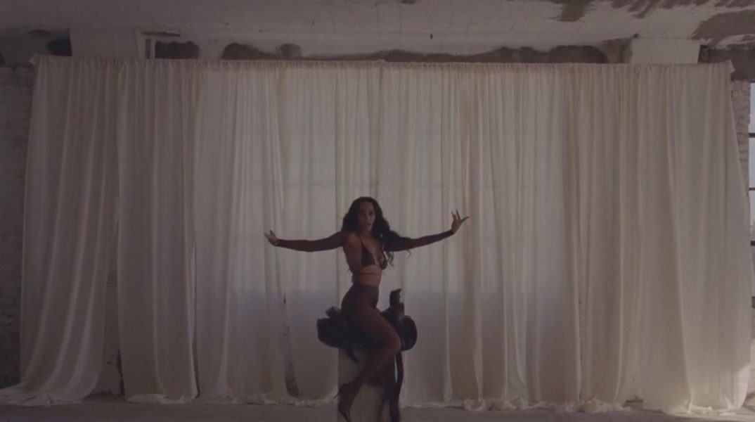
WHEN I GET HOME :: SOLANGE
I’M in the midst of planning a video shoot and have been working hard to create a cohesive visual story. Because I am venturing in the audiovisual field, I definitely appreciate this video.
Continue Reading
I’M in the midst of planning a video shoot and have been working hard to create a cohesive visual story. Because I am venturing in the audiovisual field, I definitely appreciate this video.
Continue Reading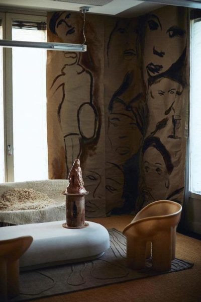
HOW ROUND FURNITURE PIECES ARE GOING MAINSTREAM This trend has been present for A WHILE. I remember skimming through magazines and seeing these editorial vignettes featuring hyper curvy furniture.
Continue Reading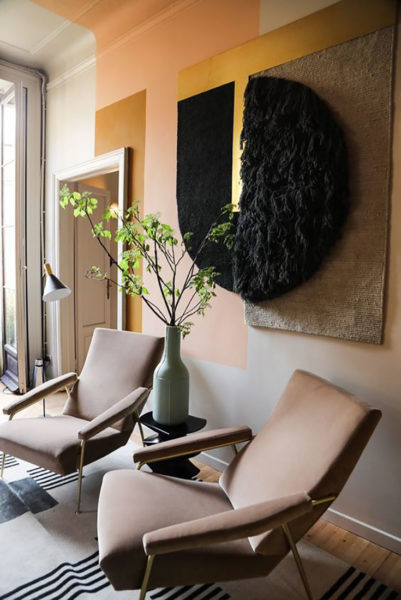
Little Update on Life and My Current Color Combo All In One! My sincerest apologies! I’ve been away for a whole year!
Continue Reading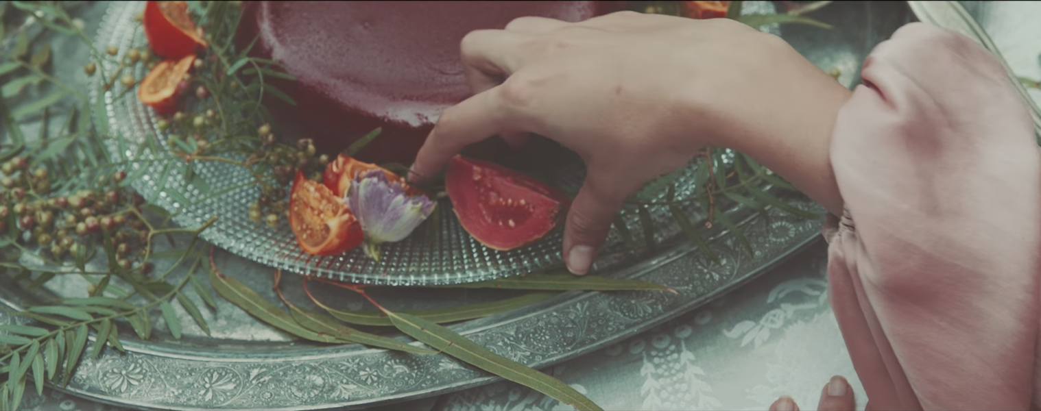
After a moody couple of days, reduced sunlight and daylight savings kicking my ass, this song really hits a sweet spot!
Continue Reading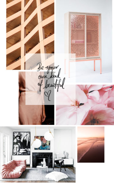
The long lasting Summer merging into a colorful autumn changed my feelings towards this season completely. To me, this experience re-defined the equivalence of fall and ultimately made me fall utterly in love with it! In honor of this beautiful and natural phenomenon, I created a mood board playing with the different blush nuances, which I see reflected in the foliage and that I'm aiming to incorporate in my color schemes and outfits.
Continue Reading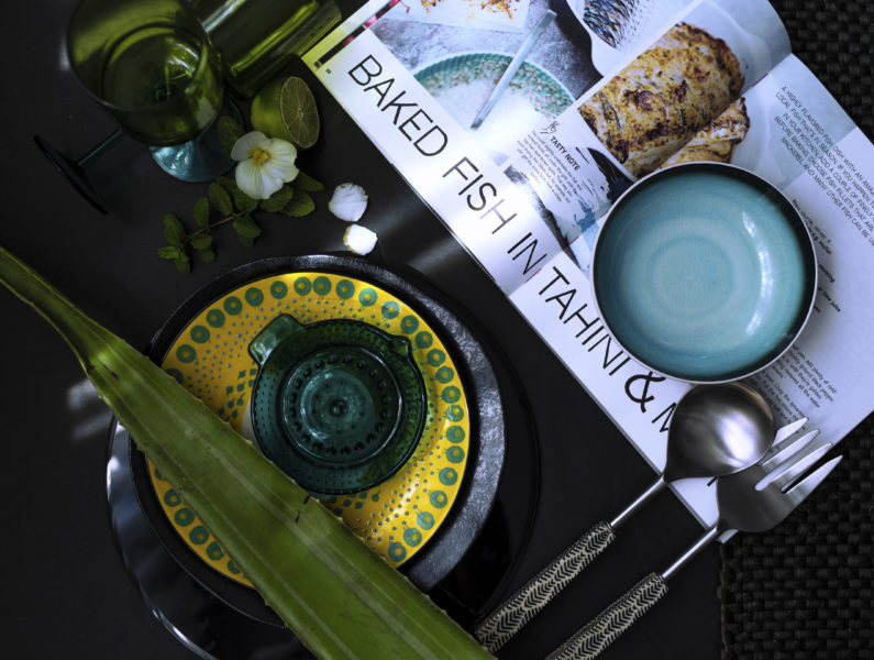
It’s been quite a challenging month between working on design projects, entertaining my 6-year-old and keeping up with life. There had been plenty of moments where I had considered having a drink for breakfast, which is actually a real thing in Germany (I swear!
Continue Reading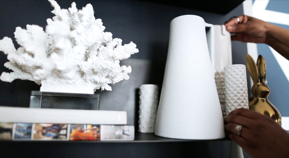
There Are Infinite Possibilities to Style Shelves & Here is How I Styled Mine
Continue Reading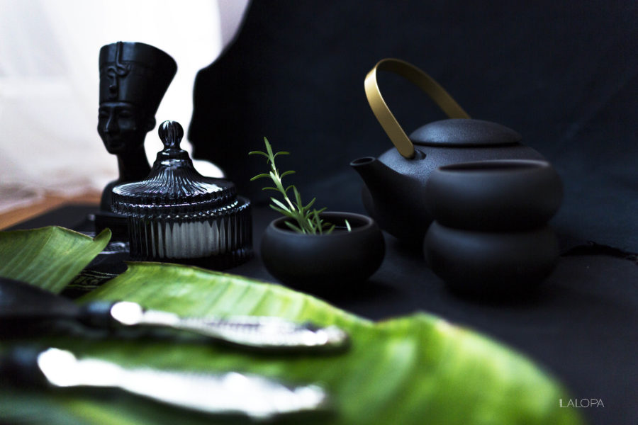
For someone, who has an infatuation with tableware, I haven’t posted much about it. I actually enjoy shooting those as it is a fun and creative way to experiment with textures on a smaller scale.
Continue Reading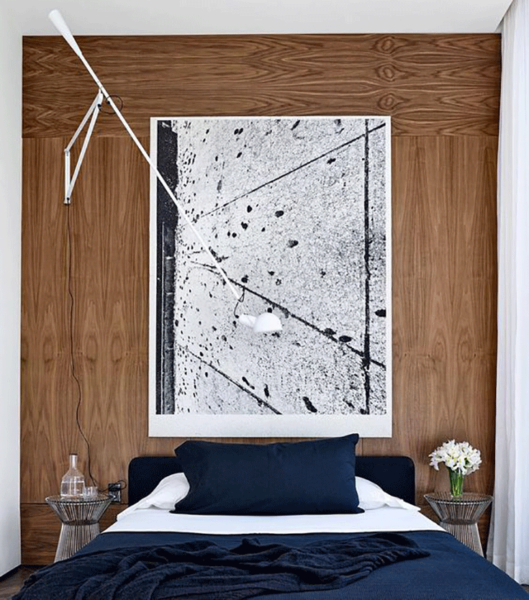
Sconces Are Uhh-mazing And Here Is Why First of all, I would like to share, I was never a big fan of sconces.
Continue Reading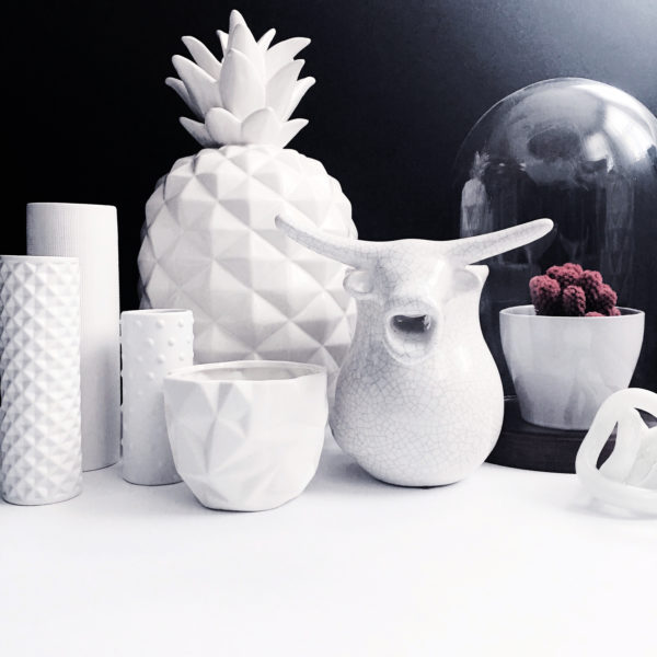
Why Only White Vases And Decor? A while ago I saw a merch display that featured all white vases and nick-nacks.
Continue ReadingThe dining room is a pretty multi-functional room in our home. This is where we eat, work or craft up some DIY projects. It’s basically where a lot of the action and magic happens. It is also a space where great conversations & discussions are held and, of course, memories are made. I think it’s essential to maximize the way you live and use your domicile. It’s healthy and makes you feel happy and more at home, as it offers to house and manifests all layers of your personality.
There is something about odd numbers, that does the magic in the cluster universe. The power of a cluster lies specifically in the group of objects working collectively and not individually. It’s almost like each of their individual aesthetic strength merges into one and sends a message to the observing eye: ” Yes, we look all so different, but yet we belong together!”
What I love most about clustering pieces is that (at least in my world) there are no rules. I go about it almost intuitively. While going through trial and error, I do realize the more opposite the materials are, the better they look as a unit! Further, the more unique they are, the more they complement each other. I personally enjoy mixing eclectic and sometimes ethnic pieces into a modern context, which is the style I mostly feel comfortable in.
Another key aspect of creating a decor vignette is to also mix items with different heights AND opposing shapes. It visually creates a 3-dimensional dynamic, which accentuates their visual composition. Putting 2 accessories with different shapes, but similar heights together don’t mix well as they are actually competing with each other since they share one characteristic: Which is the same height!
Here are different ways and essentials for arranging/composing a cluster. If you want to see some live action, check out this video where I style my shelves using these techniques.
The triangular cluster is defined by using at least 3 accessories with distinct heights and textures, offsetting each other creating a so-called “triangle”.
Tip: It takes some shifting and testing of the different looks. Take a step back and see which look you prefer.
Accessories are really, what makes the room come to completion. It’s the cherry on the icing ( perhaps the icing on my all time favorite carrot cake! Recipe soon to be shared ;-)).
The more, the merrier. I personally love collecting them piece by piece, rather than going to Home Goods and just filling up carts, due to lack of patience for the process. In this case I think it’s totally worth waiting for the right piece vs. just buying things that are good enough or available now. Pinterest is packed with ideas, and I have noticed some statement pieces that could definitely serve as conversation starters that definitely would have an impact in any space.
I love playing with the unexpected. This probably transcends from my personality: in between my ever so resting bitch face, you’ll find me rolling on the floor, because of a spontaneous laugh flash (yup that’s me! I get to 100 real quick!).
Unsurprisingly, I find my eyes drawn to neon light signage lately. Yes, it is a light, but this function becomes almost secondary. The light and the font collectively could be layered as an additional and unusual texture. Further, it’s a great way of bringing in some color since these lights can be made in different nuances. Besides that, it’s a fun opportunity to include typo into a decor scheme for all the font and quote lovers.
Feature walls can be very powerful. A surface you can use to accentuate and “embellish” a room. A great blank “canvas”, where you can express yourself and visually create a manifest of your style and simultaneously an extension of yourself. A great way to turn your place into a visual sanctuary, a place you can resort to and feel at home.
There are so many directions to take while planning a feature wall, such as placing a frame collage, a mural, wallpaper, oversized artwork or you can just simply write on the wall. The options are literally endless and that’s certainly the beauty of it.
I personally think it’s all about creating a visual moment. You are basically creating a life-sized vignette consisting of art pieces, furniture, and accessories. Important is that all pieces should complement each other and create visual interest, through a variety and preferably contrasting textures, shapes, and colors. Furthermore, you want to make sure the scale of each piece works in this collective.
Along the process, you will realize that trial and error will become your best friend. By adding and/or removing items you can analyze and work your way towards your final look and intuitively approach your internal vision of your feature wall.
And let me tell you, it is ok to first think that one item is the perfect fit, but then when actually trying it out, you realize that it doesn’t work at all. take it as a lesson, because that way you know, what certainly doesn’t work and know, what to avoid in the next piece.
SOURCES
Image 1 :: Seen on Interiorzine.com
Image 2 :: Seen on Trendenser.se
Image 3 :: Seen on Unknown
Image 4 :: Seen on Tredenser.de
Image 5 :: Seen on Homeadore.com
Image 6 :: Seen on Tamizo.com
Image 7 :: Seen on Sulia.com
Image 8 :: Seen on Thedesignchaser.com
Image 9 :: Seen on Thelifecreativeblog.com
Image 10 :: Seen on Popsugar.com
Image 11 :: Seen on DecorationArch.com
Image 12 :: Seen on Thedecorista.com
Image 13 :: Seen on Seen on Domainehome.com
Image 14 :: Seen on Myscandinavianhome.com

