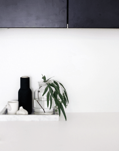
A QUICK GUIDE TO CREATING DECOR VIGNETTES
There is something about odd numbers, that does the magic in the cluster universe. The power of a cluster lies specifically in the group of objects working collectively and not individually. It’s almost like each of their individual aesthetic strength merges into one and sends a message to the observing eye: ” Yes, we look all so different, but yet we belong together!”
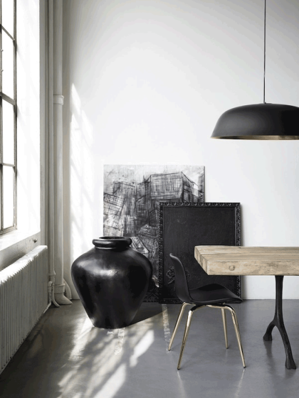
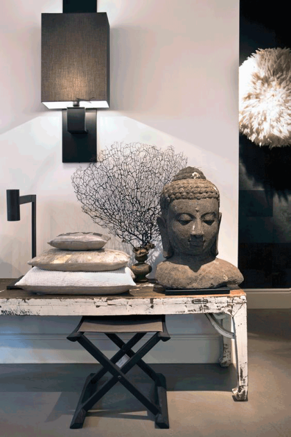
What I love most about clustering pieces is that (at least in my world) there are no rules. I go about it almost intuitively. While going through trial and error, I do realize the more opposite the materials are, the better they look as a unit! Further, the more unique they are, the more they complement each other. I personally enjoy mixing eclectic and sometimes ethnic pieces into a modern context, which is the style I mostly feel comfortable in.
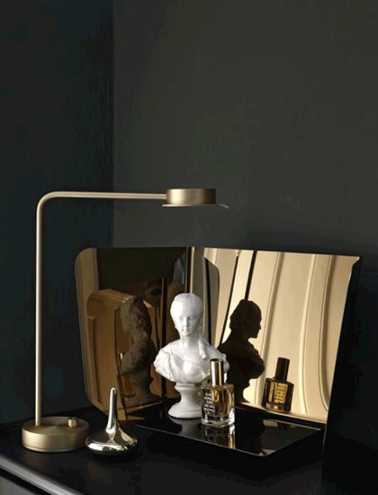
Another key aspect of creating a decor vignette is to also mix items with different heights AND opposing shapes. It visually creates a 3-dimensional dynamic, which accentuates their visual composition. Putting 2 accessories with different shapes, but similar heights together don’t mix well as they are actually competing with each other since they share one characteristic: Which is the same height!
Here are different ways and essentials for arranging/composing a cluster. If you want to see some live action, check out this video where I style my shelves using these techniques.
TRIANGULAR ARRANGEMENT
The triangular cluster is defined by using at least 3 accessories with distinct heights and textures, offsetting each other creating a so-called “triangle”.
Tip: It takes some shifting and testing of the different looks. Take a step back and see which look you prefer.

